To make eye-catching business flyer designs that will appeal to and keep your audience’s attention, there are various drag-and-drop applications available online and free flyer makers tools. Moreover, you can also get all the printing-related supplies you will need at any one of many sign supply distributors. They’re easy to use and suitable for everyone, regardless of your level of expertise in designing.
As easy as it is to make flyers, many brands find it difficult to create well-targeted flyers, creating designs that miss the point. Therefore, we selected five advertising flyer examples with clear and brilliant designs coupled with relevant information to show you the key to a winning flyer advertising strategy.
Advertising flyer examples to create a strong flyer advertising strategy
You can use flyers to attract new customers, create awareness about your company’s services, and prompt them to take specific action. Your company flyers must be professional, and you should remember to state concisely what you’re offering along with any special offers and conditions.
Listed below are five major advertising flyer examples to help you get the best out of advertisements with flyers.
Flyers that tell a story

One important thing to do before creating a flyer is to determine your target audience. This would help you to properly construct and deliver your message in a way that catches the attention of customers you want to reach.
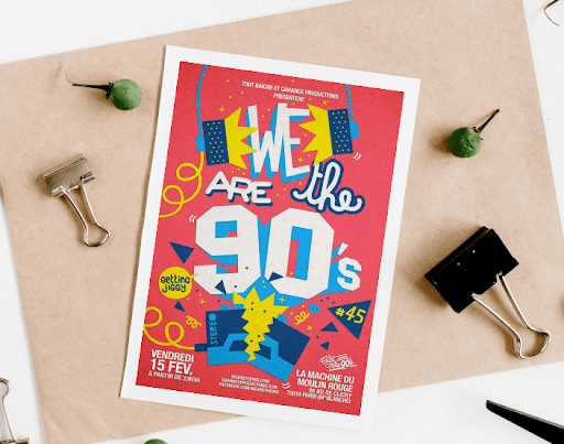
Storytelling through flyers is one of the most captivating ways to hold your audience’s attention. People’s brains are tuned to respond to storytelling, so if your flyer is telling a story suitable for the targeted audience, you are sure to penetrate their minds.
In the flyer example above, the handwritten fonts, retro fonts, and images create a dream-like feel that brings to mind memories of the 90s. If targeted to an audience in that age range, it is sure to get their attention.
Flyers with attractive fonts and colors

Color and unique fonts help you effectively divide your flyer into sections, making it more readable and attractive. It also helps to prevent the flyer from looking monotonous.
Using different fonts and colors helps draw the viewer’s attention to the different elements of your design.
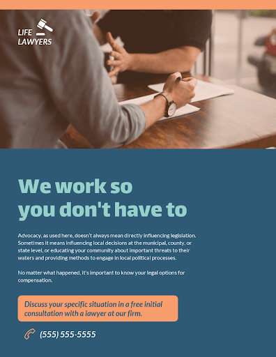
In the flyer example above, the brand uses colorful images to highlight the key services of the company. Bright colors give the company a welcoming appeal, and the distinct fonts help to stand the company name out so that it remains at the fore of the viewer’s mind.
A good tip for using fonts and colors for flyers is to try not to use too many so that the flyer does not look choked up or messy.
Flyers that call out pricing information

Many people get discouraged when they see an advert for a product they want to purchase and discover there is no pricing information. If your flyer is advertising products or services, leaving out prices in your flyer information can cause your potential customers to lose interest.
Except in cases where the purchase is unique to each individual and cannot be specified, it is best to be transparent on your flyer at all times. If there is a promo code or a ɗiscount, it should also be included in the flyer. This makes your flyer more informative and appealing.
Flyers with a distinct call to action

After providing information to your customers about what you have to offer, what exactly would you like them to do with this information?
Flyers that include a call to action within the information on the design stand a better chance of spurring the target audience to action. A call to action (CTA) is a short phrase that summons your customer to do something about the information they have just received.
The CTA could be as short as “call now” or “visit us today,” this is clear, straightforward and points the reader towards what step to take next. This could go a long way to help you connect with a potential client.
It’s best to use a distinct color or shape to highlight your call to action to make it stand out from the rest of the text on the page, like in the flyer example above.
Flyers that use eye-catching images

Humans are visual creatures. Adding an impressive image to your flyer ups the chances of attracting your potential customers. Creative images are an excellent way to keep your prospective customers’ attention.
The image can give your customer a good idea about what you have to offer before they even go through the information on the flyer.
An image of nice shoes or accessories speaks volumes and tells your customers what kind of business you’re into without having to say much. For example, the real estate company in the flyer example above used an eye-catching image of the house available for sale to attract interested buyers.
Why you should use advertising flyers
With the advertising flyer examples listed, we’ve already proved that advertising flyers are eye-catching on many levels. Hence, there are many reasons why you should start using advertising flyers to promote your business, and below are a few of them.
They are affordable
Flyers are a cost-effective way of spreading awareness about your brand. They are not expensive to produce and distribute.
They are tangible
Using flyers to advertise is important because they are things that people can touch and keep. It won’t get lost or forgotten in a digital folder with so many emails or messages.
They complement digital marketing efforts
You can use flyers to reach potential customers that are not on social media platforms. Printed materials work alongside digital marketing, each working to strengthen the message of the other.
Conclusion
Every kind of company can use flyers, from small-scale individual-owned businesses to large companies. We have gone through five top-tier flyer examples that you can work with to help your flyer advertising yield results.
By following these simple advertising flyer examples, you can make outstanding flyers that will attract customers and bring great Returns on Investment (ROI). Get started today and make your company stand out.
More must-read stories from Enterprise League:
- How to be great boss – proven and tested advice from experts.
- The best (free and paid) online networking events every owner should attend.
- Carve out some time each day to read the most important business novels.
- The only guide you will ever need about how to ask for deposit.
- Getting your product in stores – creative ideas to ensure success.
Related Articles
Who Are the Best Car Accident Lawyers in San Antonio?
You were in a car accident in San Antonio, so which lawyer should you call? A motor vehicle collision in south-central Texas is a personal crisis for business professionals. As a driver, you must contend with insurance claims, physical recovery and other sets of...
What Indicators Suggest a Business Requires Enhanced Protective Support
Effective protection is not defined by visible presence alone, but by the ability to anticipate risk, interpret signals, and respond with precision. For many organizations, the need for enhanced protective support does not emerge suddenly; it develops through...
Looking to Rent Ride-on Scrubbers? These Are the 4 Best Companies in Mississippi
Keeping large commercial floors clean requires more than basic tools. Warehouses, distribution centers, retail stores, health care facilities and more depend on ride-on floor scrubbers to maintain cleanliness and safety. These machines clean faster and cover more...
Who Are the Best Car Accident Lawyers in San Antonio?
You were in a car accident in San Antonio, so which lawyer should you call? A motor vehicle collision in south-central Texas is a personal crisis for business professionals. As a driver, you must contend with insurance claims, physical recovery and other sets of...
What Indicators Suggest a Business Requires Enhanced Protective Support
Effective protection is not defined by visible presence alone, but by the ability to anticipate risk, interpret signals, and respond with precision. For many organizations, the need for enhanced protective support does not emerge suddenly; it develops through...


